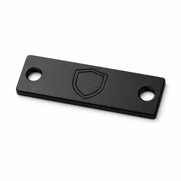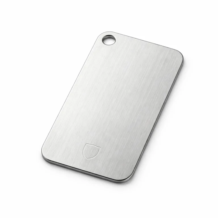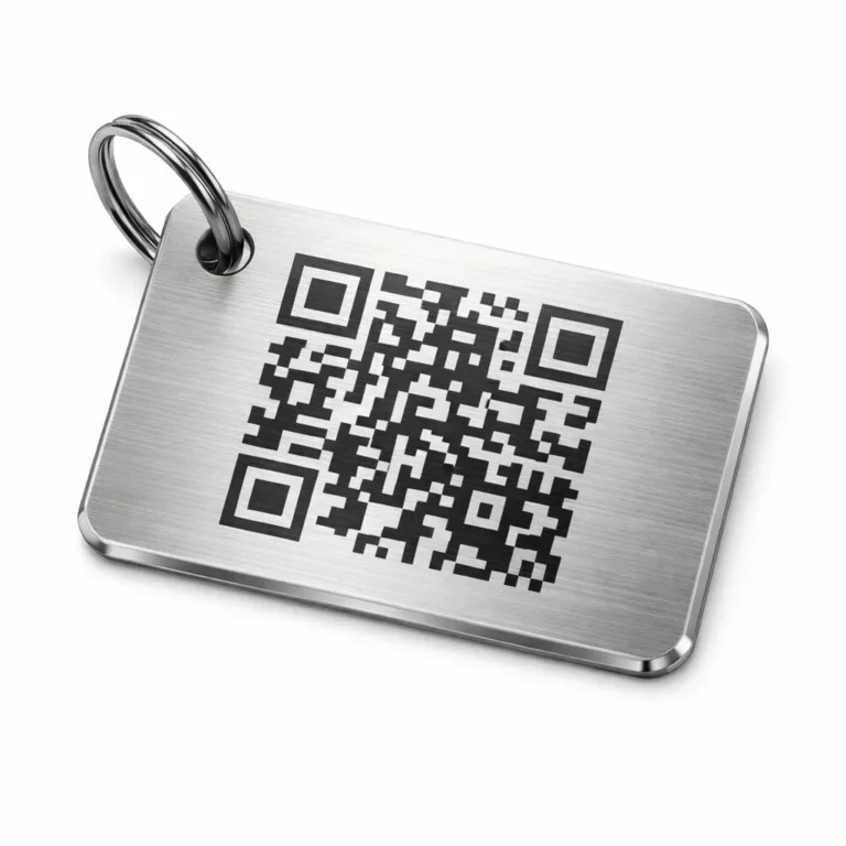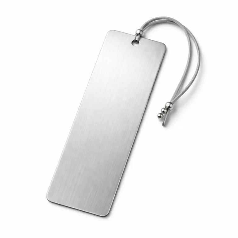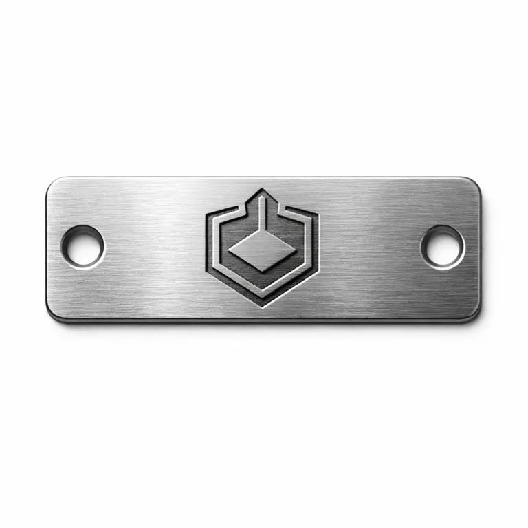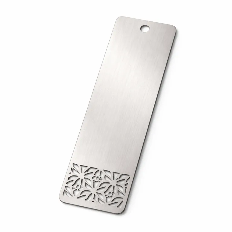
Donor recognition metal tags can do much more than display a name at a charity gala. When they are planned well, they become part of the guest experience, part of the tablescape, and part of how appreciation is communicated without disrupting the event’s tone. For nonprofit planners, event designers, and premium suppliers, the real goal is not simply to label a seat. It is to recognize support in a way that feels thoughtful, polished, and aligned with the evening’s mission, branding, and atmosphere.
If your event needs refined identification that works as both recognition and décor, our custom metal tag manufacturing solutions can support the project from material selection to personalization, finish matching, data handling, sampling, and final production planning. In gala work, small details such as hole position, edge finish, font weight, and attachment method can affect whether a tag looks premium on the table or feels out of place, so early coordination makes a visible difference.
What donor recognition tags do at charity galas
At gala level events, recognition pieces often need to do several jobs at the same time. They may identify the guest, indicate sponsorship level, reinforce table assignments, carry a short thank-you message, and leave a keepsake impression after the event. A paper place card can do some of this, but a metal tag adds permanence, weight, and a more intentional visual presence.
From our metal tag manufacturing perspective, the strongest event projects start by defining the tag’s role before discussing shape or finish. Is the tag mainly a name marker? Is it a donor tier indicator? Will guests take it home? Will it be tied to a favor box, napkin ring, menu card, or wine gift? For some planners, elegant gift message tag options fit especially well when donor appreciation extends into curated table gifts or bottle presentations.
When the purpose is clear, the design becomes much easier. Without that clarity, projects often become crowded. The tag tries to hold too much text, too many logos, and too many visual priorities, and the result feels less elegant than the event deserves.
Why metal tags work especially well for premium place settings
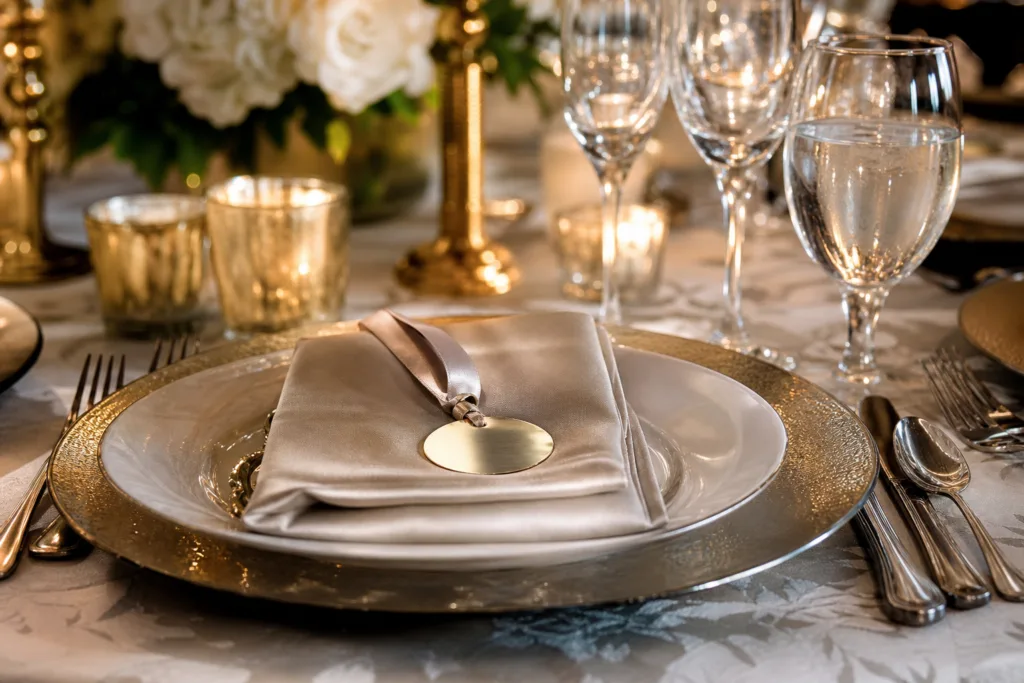
Metal tags suit upscale gala settings because they combine visual structure with tactile quality. Guests notice weight, finish, edge quality, and reflectivity very quickly, even if they do not comment on them directly. These details influence whether the place setting feels intentional and premium.
Metal also gives planners more control over consistency. Paper stock can curl, stain, or lose shape during setup. Acrylic can work in some event styles, but it creates a different visual language. Metal is useful when the event calls for a cleaner, more established, more formal presentation.
There is also a practical reason. Many gala planners want the recognition piece to remain attractive through transport, setup, service, handling, and post-event gifting. A properly produced metal tag is far less likely to look worn after being handled by event staff, positioned on plates, tied to favors, or packed for donor takeaway.
How donor recognition supports donor retention and event atmosphere
Recognition is not only about visibility. It is about tone. A donor should feel appreciated, not categorized. That is why the design and wording matter as much as the material. Personalized recognition usually works best when it feels sincere, restrained, and integrated into the event rather than obviously transactional. Research discussing how gratitude and thank-you framing affect donor response supports the idea that appreciation should feel genuine rather than pressure-based, which is relevant when planning recognition at the table setting stage, as discussed in this section on the psychology of donor appreciation.
In practical terms, that means many nonprofit events are better served by subtle hierarchy than by oversized status signals. A small icon, a discreet border treatment, or a controlled finish variation can distinguish sponsorship levels without making lower-tier guests feel visually separated. This detail may look small, but it can create problems later if it is not confirmed early. Overstated recognition can shift the mood from gratitude to ranking.
Event atmosphere also depends on table harmony. Formal place settings are judged as a whole, not item by item. Placement, spacing, visual balance, and material coordination influence how guests perceive quality and care. For gala planners working around charger plates, folded napkins, menus, and favors, it helps to consider recognized table design conventions so the tags support ambiance rather than clutter it, similar to the placement logic discussed in this guide to table setting structure.
Choosing the right donor recognition metal tags style for a gala setting
For buyers, the key is not only the product name or price, but whether the material, structure, marking method, and application requirements match the real use case. Gala projects usually fall into a few common style directions.
Classic individual name tags
These are usually small rectangles, ovals, arches, or soft-corner plates with the donor’s name and perhaps one short line such as table name or sponsorship category. This style works well when elegance and readability are the top priorities.
Recognition tags attached to favors or gift items
These pieces function as both décor and keepsake. They may be tied to a wine bottle, welcome box, leather item, or gift bag. In these cases, attachment style matters just as much as front-face design.
Decorative tags integrated into menus or napkins
These are often lighter in visual tone and may use one hole, ribbon threading, or adhesive placement. They should not overpower the dining presentation.
Tier-coded donor tags
When sponsorship levels or giving circles need to be recognized, we usually recommend using hierarchy through layout, icon size, or finish variation rather than making the text block much larger. The goal is recognition with tact.
For event suppliers that also need flexible branding treatments, premium metal nameplate customization can be a useful reference point because the same logic of finish control, logo placement, and polished presentation often applies to gala tags as well.
Material and finish options for gala use
The right material depends on visual tone, budget, weight, and how long the item needs to last after the event. In many projects, the problem is not that the buyer chose the wrong category. The problem is that some production details were not clarified before sampling or bulk production.
| Material | Best Fit | Visual Character | Practical Notes |
|---|---|---|---|
| Brass | Luxury, heritage, black-tie themes | Warm, classic, premium | Strong visual richness; good for engraved or etched donor keepsakes |
| Aluminum | Large guest counts, lighter-weight tags | Clean, versatile | Cost-efficient, easier for larger quantity gala programs |
| Stainless steel | Modern, minimal, high-end styling | Crisp, cool-toned, architectural | Durable and refined; works well for sleek typography |
| Anodized aluminum | Brand-color coordination | Controlled color finish with metallic base | Useful when event palettes need gold, black, bronze, blue, or custom tonal direction |
Brass is often chosen when the gala theme leans formal, historic, or philanthropic in a traditional sense. Stainless steel fits events with a modern luxury identity. Aluminum works well when budget control matters but the planner still wants a custom metallic result. Anodized aluminum is particularly useful when color consistency is part of the design language.
Finish choice matters just as much as base metal. Brushed, matte, satin, polished, antique, or anodized finishes all change how a tag interacts with candles, florals, and dinner lighting. A highly reflective surface may look beautiful in one concept and too harsh in another. For that reason, finish decisions should be made under realistic event-light assumptions rather than only from flat digital mockups.
Designing tags to match the gala theme and brand identity
A donor recognition tag should feel like it belongs to the event, not like it was added late for functional reasons. Theme alignment usually comes from five factors: metal color, typography, shape language, logo treatment, and attachment detail.
If the gala branding uses soft serif typography, ornate floral arrangements, and warm candlelight, a brushed brass or antique gold tone often feels more natural than bright silver. If the event identity is sharp, architectural, and contemporary, stainless steel or black anodized aluminum may fit better. This is where finish matching becomes a design decision, not just a production one.
Typography should be selected for readability at tabletop distance. Very thin letterforms may disappear under low evening light. Highly decorative scripts may look beautiful on invitations but become harder to read on a small metal surface. We usually suggest balancing a display style with a clean supporting type hierarchy.
Logo use also needs restraint. The nonprofit’s identity should be present, but on a small tag the donor’s name usually deserves the primary visual emphasis. If the logo becomes too large, the tag starts to feel like a branded promotional item rather than a refined recognition piece.
Sizing, shape, typography, and layout tips for tabletop readability
Readability at an event is different from readability on a screen. Guests view place settings from standing height, seated height, and angled lighting. That means text size, contrast, and layout spacing need practical testing.
Size planning
Small tags can look elegant, but they need enough room for full names, especially when donor lists include long surnames, honorifics, or couple formats. Before finalizing size, planners should review the actual name list, not only a few sample names. A size that works for “James Lee” may fail for “Dr. Alexandra Montgomery-Hayes.”
Shape choice
Rectangles and soft-corner rectangles are the easiest for clean layout. Ovals and circles can feel more decorative but reduce usable text width. Custom silhouettes can be striking, though they should only be used when they still support stable placement and legible text.
Typography and hierarchy
The donor name should normally be the first readable element. Sponsorship level, table assignment, or short appreciation line should be secondary. If every line uses the same weight or size, the eye has no clear path.
For projects where line precision and edge quality matter, reviewing examples of engraved metal tag detailing can help planners understand how fonts, spacing, and engraved depth translate from artwork to finished pieces.
Personalization options that add value without clutter
Personalization is one of the biggest advantages of donor recognition metal tags. The challenge is knowing what to include and what to leave out.
- Guest name: usually the core element and should be the clearest line.
- Couple or family names: useful for hosted tables, but layout needs more width.
- Sponsorship level: best handled subtly unless public tier display is part of the event strategy.
- Short thank-you phrase: works when the tag also functions as a keepsake.
- Nonprofit logo or gala emblem: useful in small scale when it supports identity without crowding the layout.
- Date or event title: helpful for commemorative value, especially if tags are retained by guests.
Some planners also use a small symbol or border system to show giving circle membership. That can work well if the hierarchy is elegant and consistent. If the donor list is sensitive, however, a visible sponsorship ranking may not be the right fit for every table.
How to balance elegance with clear recognition hierarchy
Recognition hierarchy matters, but visual diplomacy matters too. We often recommend three subtle hierarchy tools before resorting to larger text blocks or louder labels: finish variation, icon treatment, and positioning.
For example, major sponsors may receive brushed brass while general donor recognition uses champagne anodized aluminum. Or all tags may share the same base material while top-tier donors receive a framed edge or a small emblem. This keeps the event design unified while still acknowledging difference.
What usually does not work well is combining large logos, large names, large sponsorship labels, and multiple decorative borders on a very small surface. The result feels busy and can undercut the quiet elegance that many gala planners are trying to create.
Attachment and placement ideas for place settings, table cards, and favors
Placement determines whether the tag is noticed naturally or becomes a visual obstacle. The right method depends on the table format and whether the piece is meant to be removed and kept.
- On the napkin fold: refined and visible; works well with ribbon, cord, or custom loop attachment.
- Against the menu card: good for integrated layouts where the tag adds weight and distinction.
- On the favor box or gift: ideal when the tag doubles as a keepsake.
- Resting on the charger plate edge: strong visual focus, but size and stability must be tested.
- Attached to a bottle or welcome item: useful for sponsor tables, VIP seating, or donor gifts.
Attachment should be confirmed early because it affects hole diameter, hole location, edge margin, and overall tag strength. If planners are not sure which direction works best, sample setups are usually more valuable than discussing the idea only in abstract renderings.
Production methods for custom metal tags
The production method affects visual style, readability, durability, and cost. This is one of the most important decisions in a gala project because a beautiful concept can still fail if the marking method does not suit the finish or text density.
Engraving
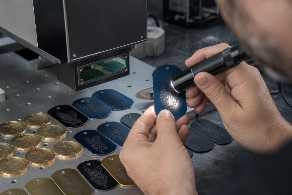
Engraving is a strong choice when the event calls for tactile permanence and crisp personalized text. It suits names, dates, and simple logo work, especially on brass, aluminum, and stainless steel. It gives a premium feel and usually supports keepsake use well.
Etching
Etching is useful when the artwork includes finer lines, detailed borders, or more delicate logo elements. It can create a refined look, especially for flatter visual styles with precise detail.
Laser marking
Laser processing can be efficient for variable data and individual names, especially where precise text control is needed. It is often used when personalization accuracy is central to the project.
Printing
Screen printing or UV printing can work when color graphics are important, but planners should think carefully about long-term handling and the desired tactile effect. For many formal donor tags, printed graphics work best as a controlled supporting element rather than the main recognition feature.
At UC Tag, we usually help buyers compare these methods based on guest count, artwork complexity, desired finish, and whether the tags are intended only for the event night or also as long-term donor keepsakes.
Planning for names, donor lists, and data accuracy before production
For personalized gala tags, data accuracy is often a bigger risk than manufacturing itself. A material can be perfect and a finish can be beautiful, but one misspelled donor name can become the detail everyone remembers for the wrong reason.
That is why we recommend locking data structure early. Confirm title style, capitalization rules, couple-name format, line breaks, sponsor labels, and any abbreviations before file submission. Decide whether names will use honorifics such as Dr., Mr., Mrs., or none at all. Also decide how to handle long names consistently rather than case by case.
Spreadsheet preparation matters. One clean approved data file is much safer than multiple versions passed between fundraising, event, and design teams. In high-profile projects, a final sign-off owner should be named clearly so that the manufacturer is working from one approved source.
Sample approval, proofing, and final QC for high-profile events
In event work, the sample is not just a visual checkpoint. It is where hidden issues are usually found: text too small, hole too close to the edge, finish too reflective, layout too crowded, cord color mismatch, or donor tier coding that feels too obvious.
That is why custom metal tag sampling support is especially useful for nonprofit galas with multiple stakeholders. A physical sample helps fundraising teams, event planners, and design teams review the same object under realistic conditions rather than approving only artwork on a screen.
Final QC should include at least these points:
- name spelling and data match
- correct donor tier or symbol assignment
- consistent finish tone across the batch
- clean edges and hole placement
- readable marking depth or print quality
- correct attachment components and counts
- packing method that keeps sets organized for setup
Packaging is easy to overlook, but it has a real impact on event setup speed. If tags are packed in table sequence or alphabetical order based on the venue plan, onsite handling becomes much easier.
Lead times, MOQ, and budget planning for gala orders
Lead time depends on material, finish, personalization level, attachment assembly, and sample approval speed. Gala projects often compress because guest lists change late. The best way to protect timing is to separate the decisions that must be locked early from the decisions that can remain flexible a little longer.
Usually, the metal type, size, finish direction, attachment method, and production method should be confirmed first. Variable data such as final donor names may sometimes be finalized later, but only if the manufacturing schedule is built around that reality.
MOQ also matters. Some materials and processes suit small premium runs better than others. For larger fundraising events, cost is often controlled by standardizing shape and construction while using variable text for personalization. That gives visual consistency without forcing every unit to be structurally unique.
Budget planning should include more than the face piece itself. Buyers should also account for sampling, attachment hardware, assembly labor, individual packing, spare quantity, and rush timing if needed.
Common mistakes to avoid in donor recognition tag design
- Too much text: a small tag is not a full message board.
- Poor contrast: low-contrast finishes can disappear in dim gala lighting.
- Ignoring long names: real donor data should drive size decisions.
- Late attachment decisions: hole placement and setup logic should not be an afterthought.
- Overstated donor tiers: recognition should support appreciation, not create awkward comparisons.
- Skipping a physical sample: event lighting and tabletop scale can change the whole impression.
- Weak data control: one spreadsheet error can affect the event experience immediately.
Post-event value and relationship impact
A well-made donor recognition tag can continue working after the gala ends. Some guests keep the piece as a memento, attach it to a personal item, display it, or simply remember the care that went into the evening. That matters because recognition is not only about one dinner. It is part of how an organization signals respect, gratitude, and attention to supporter relationships.
Visible, thoughtful recognition can strengthen positive donor feelings when it feels personal and well judged. The value does not come from making the piece expensive for its own sake. It comes from making it feel considered, relevant, and appropriate to the donor experience.
A practical checklist before ordering

- define whether the tag is for seating, recognition, gifting, or all three
- confirm material and finish based on the gala theme
- review actual donor names before locking size
- set typography hierarchy for names, tiers, and messages
- decide attachment method early
- align logo use with elegance and readability
- prepare one clean approved data file
- request a physical sample
- confirm packaging format for venue setup
- build spare quantity into the order
For planners and premium suppliers, donor recognition metal tags work best when they are treated as part of the event design system rather than a last-minute accessory. When the material, finish, personalization, placement, and quality checks are aligned, these tags can elevate charity gala place settings in a way that feels graceful, useful, and memorable.
FAQs
Are donor recognition metal tags reusable for future charity events?
Yes, they can be reusable if the design is not tied to one date, one campaign title, or one-time seating data. Reusable formats usually work best for sponsorship levels, table identifiers, or donor circle recognition, while fully personalized guest-name tags are more often designed as single-event keepsakes.
Which metal is best for an elegant charity gala look?
That depends on the event style. Brass usually suits warm, classic, and formal themes, stainless steel fits modern and minimal events, and aluminum offers a lighter and more budget-conscious option. Anodized aluminum is useful when color coordination with branding is important.
What marking method is best for personalized donor names?
Engraving and laser marking are both strong choices for personalized names because they support clear variable data and refined presentation. Etching can also work well for more detailed layouts. The right method depends on the material, finish, text size, and whether the tag is meant mainly for one-night presentation or longer-term keepsake use.
How do planners avoid mistakes in donor names and sponsorship levels?
The safest approach is to use one final approved spreadsheet, set clear formatting rules in advance, and assign one person to sign off on the donor list before production. It also helps to review long names, honorifics, couple formatting, and donor tier labels before artwork approval so the manufacturer is working from one controlled data source.
Can donor recognition metal tags include logos, short messages, or sponsorship tiers?
Yes, but the layout should stay disciplined. Most successful gala tags give the donor name the clearest visual priority, then add a small logo, subtle tier cue, or short message only if space and readability allow. Too many elements on a small tag can reduce elegance quickly.
How early should a nonprofit order donor recognition metal tags before a gala?
Earlier is always safer because gala projects often involve samples, multiple stakeholder approvals, and late donor list changes. The practical approach is to lock material, size, finish, and attachment method first, then confirm the final production schedule around the date when donor data will realistically be approved.