Key Takeaways
- Readability hinges on font choice, size, spacing, and careful layout planning.
- Contrast and finish directly influence visibility and durability.
- Manufacturing tolerances and design file accuracy matter for custom tags.
Designing Readable Pet ID Tags: Fonts, Sizes, and Layouts
Clear identification is critical for pet safety, making the design of pet ID tags more than an aesthetic decision. Selecting the best font for dog tags, proper size, and a thoughtful layout guarantees that contact information stays legible, even as tags endure daily wear. This article breaks down every essential aspect—font height, contrast, spacing, two-sided templates, and downloadable vector files—to help you engineer pet tags that offer both professionalism and peace of mind.
The Importance of Readability in Pet ID Tags
Why Font Selection Matters
A pet tag’s primary purpose is rapid identification. Fonts must be readable at a glance and withstand abrasion from fur, play, and weather. Sans-serif faces like Arial, Helvetica, and Futura are proven performers because their clear letterforms reduce misreading risk—especially in low light or on textured finishes.
Impact of Environment and Activity
Pets roam indoors and out, meaning lighting changes, dirt, and wear are inevitable. High-contrast fonts make quick legibility possible in challenging conditions.
Expert Insight
“We see up to 30% fewer service requests for re-engraving tags with wide, high-contrast sans-serif fonts and a finish that prevents glare,” notes the lead at UC Tag’s technical design team.
Best Font for Dog Tags: Proven Choices for Easy Reading
Professional Recommendations
- Roboto, Helvetica, Arial: Crisp, modern sans-serif fonts ideal for numbers and varied text weights.
- Futura or DIN: Geometric sans-serif faces, especially popular for minimalist, contemporary pet tags.
- Segoe UI or Open Sans: High legibility, scalable, and suitable for laser engraving.
- Avoid script, ornate, and condensed display fonts for pet ID purposes.
Design File Precision
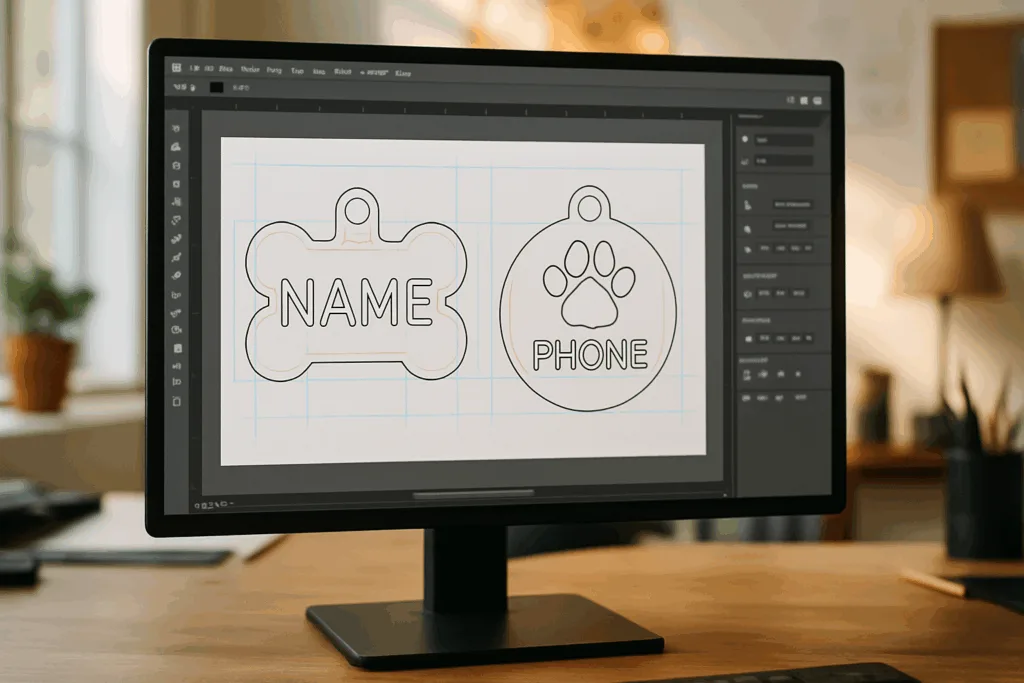
Manufacturers like UC Tag recommend vector AI/SVG files with outlined fonts, ensuring the chosen typeface remains consistent in die-casting or laser engraving. Tiny differences in vector paths can change the clarity of “1” versus “7,” or “O” versus “0.”
Font Height and Sizing: Your Complete Guide
Minimum Recommended Font Heights
| Tag Size | Font Height (mm) | Single Line | Double Line |
|---|---|---|---|
| Small (25mm) | 1.5–2.0 | Phone/Name | Short address |
| Medium (30mm) | 2.0–2.5 | Phone/Name | Full address |
| Large (35mm+) | 2.5–3.0 | Bold name | Longer info |
Real-World Sizing Tip
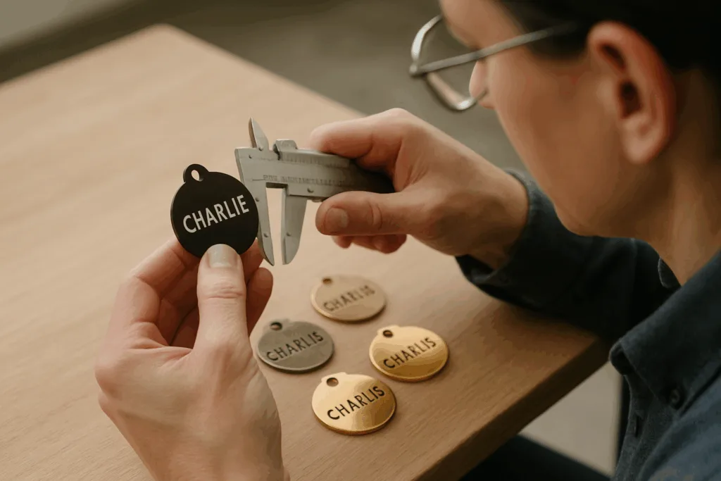
Laser engraving and die-casting processes are precise, but stray pixels in your file or too-tight line spacing may render small fonts blurry. Always preview the actual tag size (print-to-scale, or check tolerance specs from your manufacturer).
Spacing & Margin Rules
- Minimum margin from edge: 2mm
- Line spacing: At least 120% of font height
- Avoid condensed type, especially in metal tags
Contrast, Finishing, and Legibility
Finish Types and Readability
| Finish | Contrast Level | Durability | Recommended For |
|---|---|---|---|
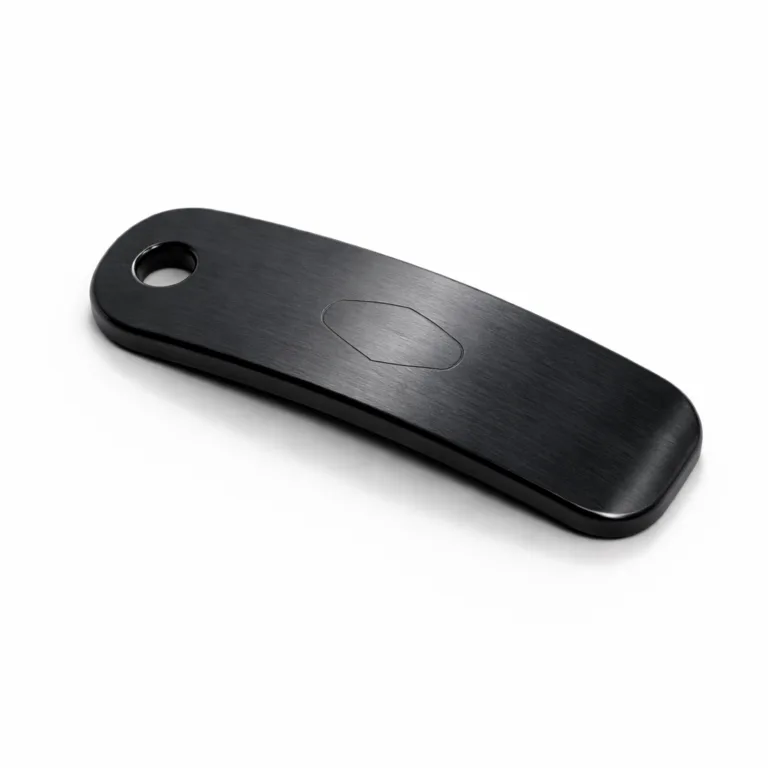
| Matte Black | Very High | Excellent | Outdoor, active pets |
| Antique Brass | Medium | High | Classic look, indoor pets |
| Nickel/Chrome | High (if laser-filled) | Very High | General use, high polish |
| Gold/Rose Gold | Medium-Low | Average | Decorative, indoor pets |
Contrast Enhancement Techniques
- Laser contrasting (dark fills against light backgrounds).
- Enamel infill for colored text on metal tags.
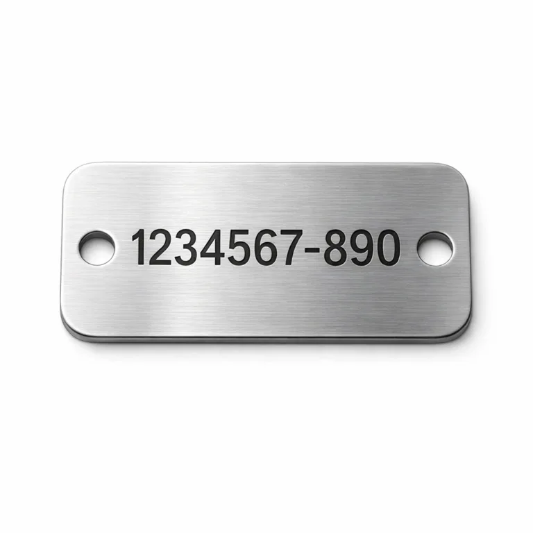
- Brushed finishes to reduce glare and reflection.
Application Example
Enamel-filled engraving is a go-to for high-contrast designs, especially when used over antique brass or matte black. UC Tag’s production lines frequently utilize multiple layers of polishing and infill to maintain sharpness even after exposure to water or salt-spray (ASTM B117).
Spacing, Kerning, and Information Hierarchy
Kerning for Clarity
Custom kerning—spacing between letters—can improve readability. Too tight: letters blur. Too loose: info stretches too far.
Hierarchy of Information
- Most important top line: Pet name or microchip ID
- Second line: Phone number
- Third line: Address or secondary contact
Practical Design File Tips
- Outline fonts before submitting for production.
- Ensure high contrast between text color and background.
- Keep core info centered, not crowding edges.
- Use vector AI or SVG export with correct curves for die stamping.
Two-Sided Layout Templates
Advantages of Double-Sided Tags
- More information without cramming.
- Reduces risk of critical data (phone, address) being worn off.
- Allows for logo or emergency instructions on the reverse.
Template Examples
| Front | Back |
|---|---|
| Pet Name, Logo | Phone, Address |
| Large Microchip ID | 24/7 Hotline, Owner Name |
| QR Code, Brand Logo | Phone, Emergency Contact |
Downloadable Layout Files
- AI (Adobe Illustrator) template: Scalable vector, ready for font outlining and logo placement.
- SVG (Scalable Vector Graphics): For web and laser engraving use, modifiable with any vector editor.
Download premium, ready-to-edit templates directly from UC Tag’s custom design library to ensure manufacturing compliance and maximal clarity.
Manufacturing Details: From Vector File to Finished Tag
File Review and Pre-Production
- All design files must be in true vector format.
- QC checks on outline thickness (≥ 0.18mm for stability).
- Font heights converted to mm/inches for die-cut accuracy.
Mold Development and Engraving
- Mold sets calibrated for final size, with test stamping per batch.
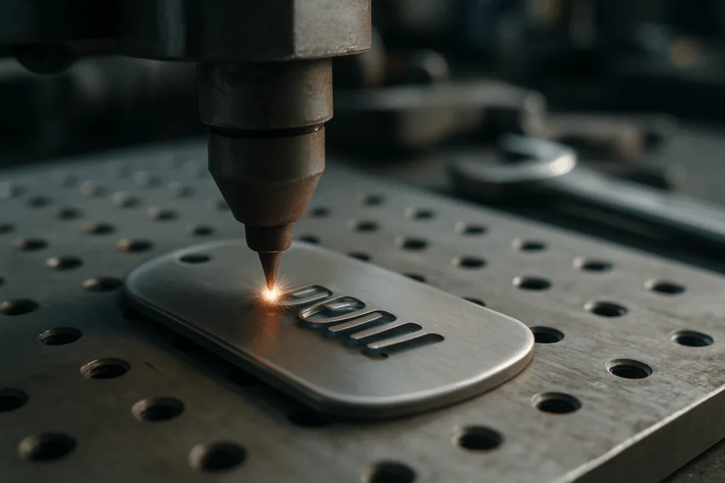
- Laser engraving or die casting delivers high contrast, crisp lines.
- QC sampling per ISO 2859 standards for readability and edge tolerance.
Finishing Options
Common finishes include matte black, antique brass, nickel, gold, and brushed chrome. Electroplating and multi-stage polishing ensure both durability and visual clarity.
Quality Control (QC) Norms
- Adhesion and salt-spray resistance tested to ASTM B117.
- Visual checks for clarity, spacing, and contrast.
- Sampling based on batch volume.
Professional manufacturers like UC Tag provide batch inspection certificates to guarantee your pet tags meet global standards.
Practical Design Review: Case Studies & Expert Tips
Case: Small Rounded Brass Tag
- Font: Futura Bold, 2.0mm height
- Finish: Antique Brass, black enamel infill
- Layout: Name front, phone back
Case: Large Zinc-Alloy Tag
- Font: DIN Pro Regular, 3.0mm height
- Finish: Matte Black, white laser engraving
- Layout: Name and logo front, full address back
Lessons Learned
- High-contrast engraving shows best over time
- Wide fonts keep digits clear on small tags
- Two-sided layouts prevent overcrowding
Expert Tip
“Design for function first—glare reduction, durable finish, and clear font outlines will keep a tag readable far longer than any decorative touch.”
Addressing Common Pet Tag Design Challenges
Challenge: Small Tags but Long Names
Opt for condensed layouts or double-sided tags. Use abbreviations (Jonathan → Jon) or initials for secondary info.
Challenge: Highly Active Pets
Matte finishes, deeper engraving, and enamel infill resist constant abrasion, sweat, and water.
Challenge: Multiple Contacts
Place primary contact on the front with large font; secondary info on reverse.
QC Solutions
- Multiple font proof samples pre-manufacturing
- Strict spacing and kerning reviews
Care and Longevity: Preserving Readability Over Time
Cleaning Instructions
- Use soft cloth, avoid abrasive cleaners.
- Mild soapy water preserves finish; towel dry fully.
Wear Resistance
Tags with laser contrast and infill show minimal fading for 3–5 years under normal wear, subject to material and exposure.
When to Replace
- If font blurring occurs.
- If polishing no longer restores shine.
- If contact info becomes mere imprints.
Frequently Asked Questions
What is the best font for dog tags?
The best font for dog tags is a clear, bold sans-serif such as Arial, Helvetica, DIN, or Futura. These ensure crisp legibility, especially in laser or die-engraved formats.
What is the ideal font size for pet tags?
Font height typically ranges from 1.5mm on small tags to 3mm for large tags, ensuring clarity without overcrowding. Always reference manufacturer tolerance charts.
Should I choose one-sided or double-sided pet tags?
Double-sided tags allow more information and clearer layouts. Use the reverse for address or secondary contact; keep primary info (name/phone) prominent.
How does finish affect readability?
Matte black and enamel-filled finishes offer the highest contrast for engraved text. Brushed and antique brass finish reduce glare and aid long-term visibility.
What file format is best for custom pet tag design?
Vector formats like AI and SVG are ideal. They preserve font accuracy, sizing, and allow for correct die-cut or laser engraving in manufacturing.
How do I maintain the legibility of my pet’s tag?
Regular cleaning with a soft cloth, avoiding abrasive chemicals, and choosing high-contrast engraving help maintain font clarity for several years.

