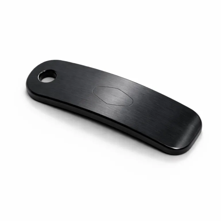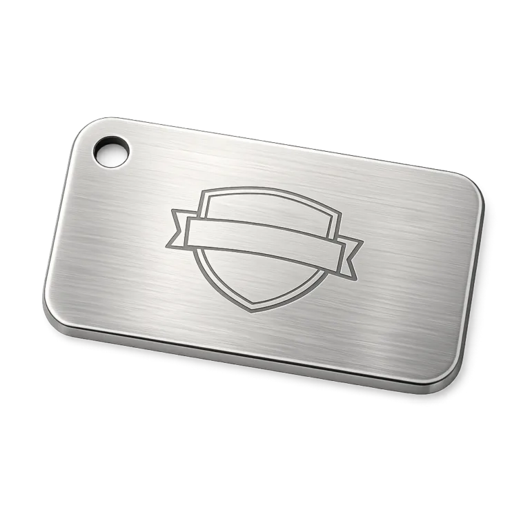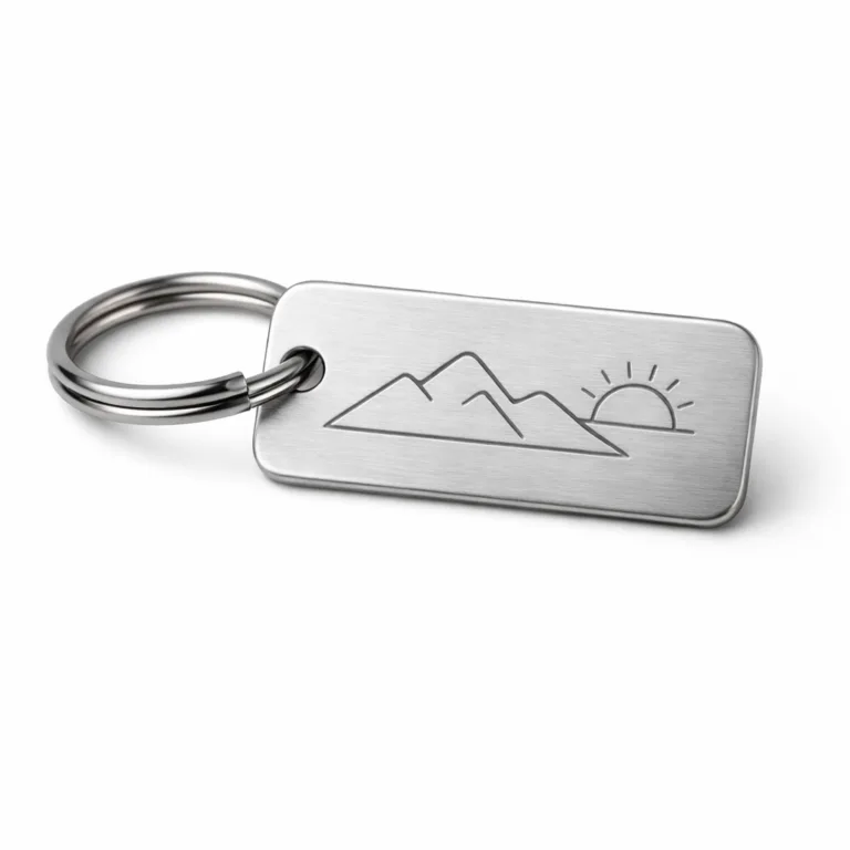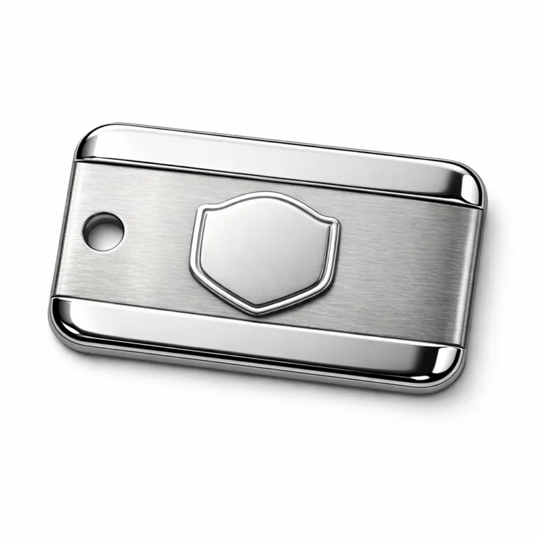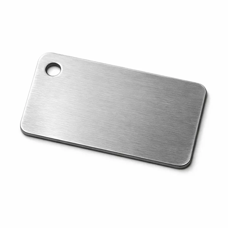
Branded Key Fobs can look like a small operational detail, but in coworking spaces they often sit at the intersection of access, daily convenience, and brand visibility. For operators, the value is not only that a member can tap into a door or identify a locker. The real question is whether the fob feels consistent with the workspace brand, holds up to daily handling, works with the access system you already use, and stays readable after months of use. In many coworking projects, the difference between a smooth rollout and an annoying replacement cycle comes down to design choices that seem minor at the start.
If your project needs durable branding plus day-to-day usability, our custom keychain tag manufacturing support is usually where the planning becomes more practical. We help buyers compare materials, branding methods, attachment structures, numbering or code options, and sample approval details before bulk production, so the final key fobs match the real member journey rather than just a mockup on screen.
What branded key fobs do in a coworking environment
In a coworking setting, a key fob is rarely just an accessory. It can function as a door credential, room identifier, locker tag, check-in aid, or simple member token that reduces friction at reception and shared facilities. Some spaces use one fob across multiple touchpoints, while others separate building access from locker or mailbox access. Either way, the fob becomes part of the operational system.
From our manufacturing perspective, buyers get better results when they define the use scenario first. A front-door access fob may need chip compatibility and a highly consistent casing shape. A locker or amenity tag may prioritize readability and color coding. A promotional welcome-pack fob may place more emphasis on logo visibility and finish. These are different products even if they are all called key fobs.
For operators comparing structure and appearance, looking at different metal keychain tag options can help clarify whether the project needs a premium branded accessory, a functional access companion, or a hybrid design that does both.
Why coworking spaces use branded key fobs for members
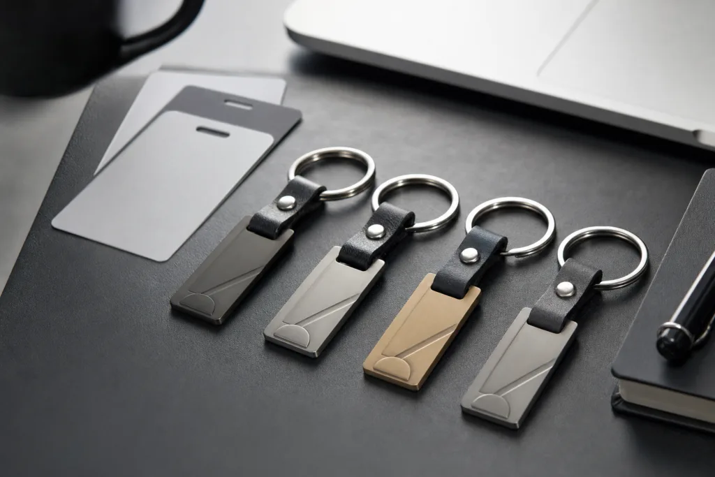
Coworking operators usually adopt branded key fobs for three practical reasons. First, they simplify member movement. Second, they create a visible sense of belonging. Third, they give the brand a repeated, low-effort presence in everyday use. Unlike a brochure or launch gift, a key fob stays in circulation.
This matters more in coworking than in many other environments because the member experience is repetitive. People enter the building, move through shared zones, unlock storage, attend meeting rooms, and leave again. A branded access item is seen many times in the same week. That repeated exposure gives it more operational and brand value than many one-time printed materials.
There is also a practical management reason. A clearly identified fob system can support faster staff recognition, simpler replacement handling, and cleaner onboarding for new members. When key fobs are standardized, teams waste less time explaining who gets what and how it should be used.
Member experience benefits: belonging, professionalism, and convenience
Member experience is often discussed in broad terms, but key fobs affect it in very concrete ways. A member who receives a well-made fob during onboarding gets a clearer signal that the space is organized. A flimsy or generic token can still work, but it may not reinforce the same level of confidence.
Belonging is one of the overlooked benefits. In coworking, many members are independent professionals or small teams who want flexibility without feeling temporary. A branded item that is useful every day can support that sense of membership. It is not about luxury. It is about whether the physical touchpoint feels intentional.
Convenience also matters. A key fob that is too large becomes annoying in a pocket. One that is too small can be easy to lose. A ring hole placed too close to the edge may deform under repeated use. Sharp corners may catch on fabric or lanyards. These details may look minor on a drawing, but they affect adoption and satisfaction later.
Where branding durability matters, many operators prefer engraved keychain customization because the branding remains readable even when the fob is handled daily, carried with keys, or exposed to abrasion from bags and desks.
Brand visibility inside and outside the space
Branding value is stronger when the fob moves beyond the reception desk. Members carry it to cafés, commute with it, leave it on meeting tables, and attach it to bags or keys. That means the item can create light but repeated brand exposure without feeling like advertising.
Inside the workspace, branded key fobs also help unify the visual environment. When visitor passes, member access items, locker identifiers, and wayfinding cues all feel aligned, the space looks more deliberate. This does not require expensive decoration. It requires consistency in logo use, finish, and color language.
Outside the space, the effect is more subtle. A clean, durable fob can become part of a member’s everyday carry. That does not guarantee marketing reach, but it does increase the number of times the brand is seen in ordinary movement. For coworking operators, this is useful because it reinforces recognition in a low-friction way.
Functional use cases: access, lockers, rooms, and identification
Let’s look at what actually affects the result. Different use cases place different demands on the key fob.
| Use Case | Main Requirement | Important Design Detail | Common Risk |
|---|---|---|---|
| Main door access | System compatibility and reliable carry | Correct chip or insert structure, compact size | Focusing on appearance before access requirements are confirmed |
| Locker access or labeling | Quick recognition | Numbering, color coding, scratch-resistant marking | Small text that becomes unreadable |
| Meeting room or zone entry | Controlled permissions | Serialized ID or coded management logic | Mixing permanent and temporary users with the same visual format |
| Member identification | Clear brand and member link | Readable logo, optional name or ID | Overcrowded artwork on a small format |
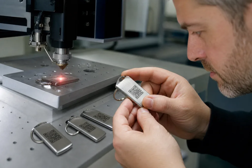
For operators using digital check-in or hybrid access workflows, QR code keychain tags for access and branding can be useful when a scannable element is needed alongside the physical fob identity. In these projects, the key is confirming how the code will be scanned, how much contrast is needed, and whether the code is for internal management, member perks, or both.
Choosing the right key fob material and finish for daily use
Material choice should follow the environment and the expected life cycle. In coworking spaces, the most common question is whether the fob should feel premium, practical, or highly durable. Different metals and finishes support different priorities.
| Material or Finish Direction | Where It Fits | Advantages | Points to Confirm |
|---|---|---|---|
| Aluminum | Lightweight branded fobs | Easy to color, light to carry | Confirm scratch expectations and edge treatment |
| Stainless steel | High-wear or long-life programs | Strong, stable appearance, corrosion resistance | Usually heavier and may increase cost |
| Brass | Warm, premium visual identity | Distinctive look, good for upscale branding | Need to confirm finish aging expectations |
| Anodized or coated finish | Color-led branding | Helps match brand palette | Color consistency between sample and bulk is important |
| Brushed or matte finish | Professional, understated designs | Fingerprints may be less visible | Fine artwork detail should be tested before approval |
In coworking projects, stainless steel or robust aluminum designs are common because they balance appearance and daily handling. A polished finish may look strong in a presentation, but a brushed or matte surface can be more forgiving in actual use. This is one of those decisions where the sample often tells you more than the rendering.
Some operators also need a more rugged structure because the fobs are used in higher-traffic spaces, mixed-use buildings, or semi-industrial creative campuses. In those cases, reviewing heavy-duty keychain tags for daily use helps clarify what extra thickness, stronger attachment points, or harder-wearing structures may be worth specifying.
Design considerations for branded key fobs in coworking spaces
Good key fob design is usually about restraint. Buyers sometimes try to fit too many goals into a very small format: logo, slogan, QR code, serial number, color coding, and decorative shape. The result can look busy and become harder to use.
Logo placement should be readable at a glance. If the logo is highly detailed, it may need to be simplified for small-scale production. Size and shape should reflect how the item will be carried. Rounded rectangles, circles, and soft-edge custom forms usually perform better in daily use than sharp novelty shapes. Hole location should also be checked early. If the hole is too close to a corner, stress cracking or deformation becomes more likely over time.
Color can help segment plans or member tiers, but overcomplicating the system can create confusion. A simpler hierarchy often works better: one standard brand version, one visitor version, and one staff or premium access version. That is easier to manage in stock and easier for front-desk teams to explain.
Branding methods: engraving, printing, embossing, and other options
The marking method should match both the look you want and the wear conditions you expect. This is where many buying decisions go wrong, because a method that looks good on day one may not fit the actual usage pattern.
| Method | Best For | Strength | Watch-Out |
|---|---|---|---|
| Laser engraving | Long-term readability | Durable marking, clear identification | Very fine details may need testing |
| Chemical etching | Detailed logos and cleaner line work | Good definition for complex artwork | Depth and finish effect should be approved in sample |
| Screen or UV printing | Color-driven branding | Strong visual impact | Wear resistance depends on surface and use conditions |
| Embossed or stamped effects | Tactile premium branding | Distinct feel and visual depth | May limit very small text or data content |
For buyers, the key is not only the product name or price, but whether the material, structure, marking method, and application requirements match the real use case. If the fob will be tossed into bags with keys and chargers, engraving or etched marking is often more practical than relying only on surface print.
Durability factors that affect replacement rates
Durability is not only about the metal itself. It also depends on edge quality, thickness, hole reinforcement, attachment ring quality, and whether the finish hides or highlights wear. In many projects, the problem is not that the buyer chose the wrong category. The problem is that some production details were not clarified before sampling or bulk production.
Here are the wear points we usually ask buyers to consider:
- Will the fob be stored with keys, tools, or metal accessories?
- Will members attach it to bags, lanyards, or belt clips?
- Will it be used indoors only, or also in rain and commute conditions?
- Does the logo need to stay visually strong after surface scratching?
- Is replacement cost more sensitive than first-order unit cost?
This detail may look small, but it can create problems later if it is not confirmed early. For example, a very thin fob can reduce initial cost but may bend or distort at the attachment point. A highly reflective finish can show scratches quickly. A dark coating may look premium but should be tested for how it ages in real handling conditions.
How to match key fob design to your coworking brand identity
Coworking brands vary a lot. Some want a clean corporate look that supports enterprise clients. Others want a warm creative identity. Some run multiple sites and need visual consistency across locations. The fob should follow that brand logic rather than trying to become a separate design statement.
A practical way to decide is to define three things first: the brand tone, the daily use pattern, and the expected replacement cycle. If your space emphasizes premium professionalism, a restrained metal finish with subtle engraving may fit better than bright novelty colors. If your space targets makers, students, or casual community members, stronger color contrast and simpler identification may work better.
At UC Tag, we usually advise buyers to review the key fob as part of the wider touchpoint system: reception signage, room markers, lockers, lanyards, welcome kits, and packaging. A fob works better when it belongs to that larger system instead of being designed in isolation.
Security and access control considerations
When a branded key fob also supports access control, security planning has to come before appearance. The buyer should confirm what the access system requires, whether inserts or encoded elements are supplied separately, and how lost fobs will be managed. A visually strong key fob is still a weak operational tool if replacement and deactivation are unclear.
Some spaces need a direct access credential. Others only need a branded carrier attached to an existing access insert. The difference affects size, structure, and production planning. It can also affect MOQ because standardized carriers may be simpler to sample than fully integrated access pieces.
For multi-site operators, numbering logic is important. If one fob format is shared across buildings, serialized control becomes much easier during onboarding, inventory checks, and loss reporting. That is especially helpful when teams grow and administration becomes less centralized.
Personalization options: names, serial numbers, QR codes, and IDs
Personalization adds value when it serves a process. It should not be added just because it is available. Names can support premium member programs or assigned desks. Serial numbers help administration. QR codes can connect to digital resources, benefits, or identification workflows. Internal access IDs support record keeping.
The practical issue is layout discipline. Small products can become crowded very quickly. If a QR code is included, it must remain scannable after the chosen finish and marking method are applied. If names are included, the font size must remain readable across short and long names. If serial ranges are used, data formatting should be locked before production so there is no confusion in the sequence.
In our production work, variable data projects benefit from a clear spreadsheet, one approved format, and one final proof logic before mass production starts. That reduces the risk of sequence errors, duplicate records, or inconsistent capitalization.
Ordering considerations: MOQ, lead time, artwork, and sample approval
For coworking operators, the commercial decision is usually not only about the first launch batch. It is also about reorder practicality. A good supplier discussion should cover MOQ, whether repeat batches can match previous colors and marking styles, how serialized data will be managed, and what happens if the operator expands to more sites.
Artwork preparation should be treated as a production step, not a design afterthought. Buyers should confirm logo file format, line thickness, text size, finish reference, hole position, and whether both sides of the fob carry content. If variable data is needed, the data file structure should be approved before the physical sample stage where possible.
Sample approval is where many future problems can be prevented. We recommend checking not only the look, but also the feel in the hand, ring attachment strength, edge smoothness, readability under office lighting, and whether the item is easy to distinguish from other everyday key items.
Common mistakes to avoid when specifying custom key fobs
Some mistakes show up repeatedly across custom projects:
- Choosing by appearance first and confirming access compatibility later.
- Using highly detailed artwork that does not scale well to the actual fob size.
- Selecting a finish that looks impressive in a render but scratches visibly in normal use.
- Forgetting to define numbering, coding, or member data structure before production.
- Approving a sample visually without testing handling, attachment, and readability.
- Ignoring reorders and expansion needs when setting the first specification.
Most of these issues are avoidable. The solution is not a more complicated brief. It is a clearer one. State what the fob must do, how it will be used, how long it should look presentable, and what information must stay readable.
A practical decision checklist for coworking operators
Before placing an order, it helps to review the project in a simple decision sequence:
- What is the primary function: access, branding, identification, or a mix?
- What daily wear conditions should the fob withstand?
- Which material and finish match both your brand and your handling reality?
- Do you need names, serial numbers, QR codes, or only a logo?
- Will the item be issued once, replaced often, or reordered site by site?
- Has a real-use sample been approved, not just the artwork?
- Are packaging, handout method, and spare inventory already planned?
For buyers comparing suppliers, the useful question is not simply who can produce a branded key fob. It is who can help translate the operational need into the right material, marking, attachment, and data structure with fewer surprises in bulk production.
Conclusion
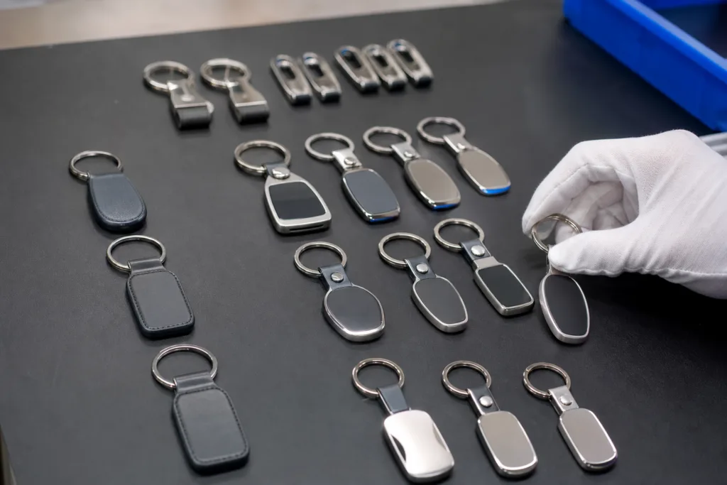
Branded Key Fobs can support more than access in Coworking Spaces. When specified well, they improve onboarding, reduce friction in daily movement, reinforce brand presence, and give members a touchpoint that feels intentional rather than generic. The practical result depends on matching design, material, marking method, and personalization to real use conditions. If operators clarify those points early, key fobs become a reliable part of the member experience instead of a small item that creates repeated replacements and avoidable confusion.
FAQs
What material is usually most practical for branded key fobs in coworking spaces?
For many coworking projects, lightweight aluminum or more robust stainless steel are the most practical choices because they balance brand presentation with daily handling. The right option depends on whether you prioritize lower carry weight, a more premium feel, stronger scratch tolerance, or longer replacement cycles.
Should coworking key fobs use engraving or printed branding?
If the fobs will be used every day and handled roughly, engraving is often the safer choice because the branding stays readable longer. Printed branding can work well when color is important, but buyers should confirm how the surface will wear in bags, pockets, and shared work environments before choosing it as the main marking method.
Can branded key fobs include member names, serial numbers, or QR codes?
Yes, but personalization should be added only when it supports a real process such as member identification, inventory control, or digital interaction. The main thing to confirm is that the layout remains readable and that the data file format is finalized before production so numbering, names, or QR content are applied consistently.
How do we avoid ordering key fobs that look good but are inconvenient to use?
The best way is to test the sample as a real everyday object, not only as a branding item. Check the size in hand, attachment ring position, edge smoothness, pocket comfort, logo readability, and how easy it is to distinguish from other keys or access items during normal member use.
What should be confirmed before approving a bulk order?
Buyers should confirm material, thickness, finish, hole position, attachment type, branding method, data format, and sample approval standard before bulk production starts. It is also worth confirming reorder consistency, packaging method, and how spare units or replacements will be handled after the first delivery.
Are branded key fobs worth it for coworking spaces that already use digital access systems?
In many cases, yes, because a branded physical fob can still make access more convenient, support quick identification, and add a consistent member touchpoint even when the main system is digital. The value is strongest when the fob is integrated into the actual workflow instead of being treated as a separate giveaway.