Introduction: Pantone Matching, Metal Finishing, and Your Brand’s Visual Identity
When creating branded metal products, getting your colors right isn’t just about visual appeal—it’s about trust, recognition, and consistency. Pantone Matching for metal finishing is the key to presenting your brand exactly as envisioned, whether you’re designing logo tags, nameplates, packaging elements, or product hardware. Thanks to the unique challenges that metal surfaces bring—namely their reflective quality, base coloration, and finish type—achieving true color accuracy requires a blend of technical knowledge, clear communication, and practical testing. In this article, we’ll explore how to ensure your brand colors look right on metal, demystify Pantone matching, and reveal methods to lock in consistent results each time.
The Importance of Pantone Matching in Metal Finishing

Pantone colors are the universal language of brand identity. By specifying exact Pantone codes, companies and designers guarantee that colors remain faithful across various materials and production batches. However, metal surfaces—unlike paper, fabric, or plastic—change how pigments and coatings appear. Reflection, base tone, and finish selection all shape the final look, making Pantone matching a crucial step to meet brand guidelines and reassure customers.
Why Metal Surfaces Present Unique Color Challenges
Metal’s reflective nature alters how colors look under different light conditions. Even the same Pantone shade can appear glossier, darker, or slightly different—depending on the alloy, surface treatment, and texture. Satin, polished, or matte finishes further shift hues, commonly leading to unexpected color shifts. Manufacturers and designers must account for these factors to avoid disappointment at delivery.
The Basics of Pantone Color Systems
Pantone’s standardized color matching system enables precise color reproduction by assigning a unique code to each shade. This code guides manufacturers in creating custom pigments and coatings but doesn’t guarantee identical visual results on all substrates. Understanding Pantone basics helps teams communicate more effectively and achieve color confidence.
Explaining Pantone Matching for Metal Finishing
Pantone matching on metal involves translating ink or paint formulas into specialized coatings, enamels, or plating baths that interact with the underlying metal. Success means working closely with production partners who understand chemistry, application variables, and real-world tolerances. Sample-to-sample consistency rarely happens by accident—it comes from experience and process control.
Communicating Pantone Color Specifications to Manufacturers
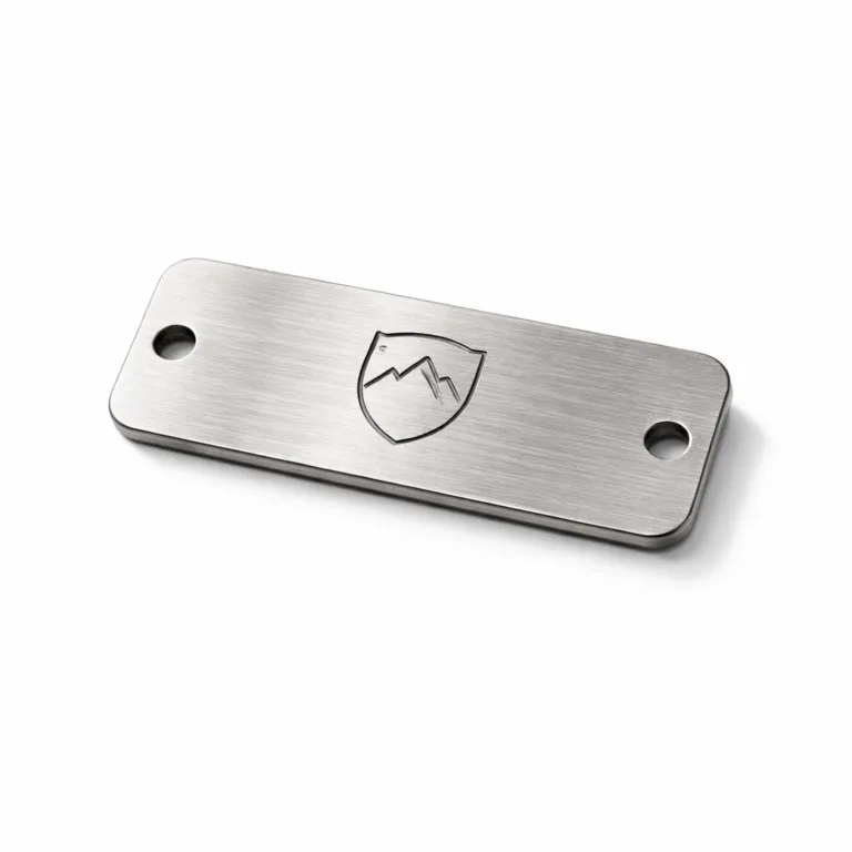
Clear, unambiguous communication is essential. Provide the exact Pantone code, finish type, gloss level, and, if possible, reference swatches. For custom metal tags, using the custom metal tag solutions page as a guide can show manufacturers what details they need and why it matters for brand identity.
Understanding Substrate Influence: How Metal Alters Pantone Colors
Every metal alloy influences base color. Stainless steel, brass, aluminum, and zinc alloy each change how topcoats look. For instance, white enamel on gold-plated brass appears warmer than on nickel-plated steel. Testing colors directly on the finished metal avoids unpleasant surprises and expensive corrections.
Finish Types: Matte, Glossy, Brushed, and Textured Effects
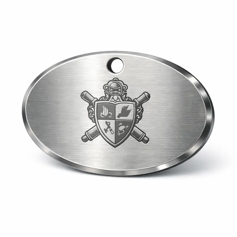
Finish controls both visual and tactile experience. Matte finishes diffuse light and make colors appear softer; gloss enhances saturation and depth but can create glare. Brushed and sandblasted metals add subtle grain, affecting pigment laydown. Explore finish options on the surface treatments for dog tags guide to see real industry examples.
Pigment Application Essentials: Enamel, Screen Printing, Pad Printing, and More
To apply Pantone colors to metal, manufacturers use enamel fill, screen printing, pad printing, or electro-coating. Each method interacts uniquely with light and surface imperfections. Enamel-filled tags excel for durability and color richness, while direct printing may suit lighter branding requirements. Consider the enamel-filled dog tags color matching guide for process and outcome comparisons.
Sample Testing: Why It’s Non-Negotiable for Accurate Color Matching
Before committing to mass production, request sample pieces with your exact Pantone colors on the selected metal and finish. Sample approval is your best insurance for brand alignment. Use feedback from physical samples to adjust gloss level, pigment density, or texture bias.
Selecting the Right Pantone Colors for Metal Finishes
Sometimes, your usual brand Pantone color may not look correct on metal. Collaboration between designers and manufacturers helps choose shades that deliver the intended effect. Opt for slightly adjusted Pantone codes if standard colors look off in initial samples.
Collaborating with Manufacturers: Questions to Ask About Color Processes
Discuss color matching techniques, process controls, and quality checks. Ask about pigment brands, application precision, curing methods, and how environmental factors (such as humidity and temperature) affect final color stability.
Real-World Challenges: Common Causes of Color Variance on Metal
Color inconsistency often springs from batch-to-batch process variation, surface impurities, improper curing, or coating thickness. Even minor mistakes yield visible discrepancies—especially when products are compared side-by-side. Practical experience shows why reputable manufacturers use batch controls and rigorous QC for every run.
Batch Testing and Quality Control in Metal Color Matching
Reliable producers run batch color tests and maintain strict documentation. Each batch should align with your approved samples and Pantone references. Audit sample pieces regularly as an industry best practice to keep brands confident and customers satisfied.

Documentation: Keeping a Record of Color Approvals and Reference Samples
Maintaining detailed records—Pantone codes, finish specs, physical samples, and supplier notes—helps avoid confusion and disputes down the line. Well-kept documentation supports long-term batch consistency across product lines and reorders.
Case Studies: Success Stories and Lessons Learned
Leading brands have learned by trial and error that Pantone matching for metal finishing is part science, part craft. Small differences in pigment or process can create major shifts in customer perception. Review the case studies from concept to mass production for real-world lessons.
Tips for Designers: Avoiding Common Pitfalls in Metal Color Matching
- Request fully finished test samples early
- Specify both Pantone codes and finish details
- Communicate intended lighting/display environments
- Consider substrate influence and base color
- Stay flexible—slight Pantone adjustments can be necessary
Specifying Gloss Level and Finish Type When Requesting Pantone Matching
Include gloss units (measured in GU), finish descriptor (matte, satin, gloss), and surface texture info in your color requests. These details dramatically affect how your specified shade looks to end users.
Critical Factors: Edge Cases and Difficult Colors
Bright oranges, deep blues, metallic golds—certain Pantone colors are especially tricky on metal. Achieving punchy coverage on a shiny silver background may need specialized primer or multi-layer construction. Consult your supplier—and don’t hesitate to iterate samples.
Role of Environmental Lighting in Metal Color Appearance
Ambient light dramatically affects perceived color. Natural light, warm indoor bulbs, or retail spotlights can shift tones up to several shades. Test samples in relevant settings before sign-off to ensure brand coherence in each use case.
Best Practices for Consistent Brand Colors on Metal Products
- Communicate frequently and clearly with your supplier
- Request multiple sample rounds if needed
- Use only vetted pigment sources
- Document every approval and change
- Inspect products under standard and actual lighting conditions
The Role of Pantone Matching in Custom Metal Tags and Branding
Whether you’re designing logo tags, custom packaging plates, or garment accessories, Pantone matching delivers visible consistency across diverse product ranges. Metal-based branding elements look professional and impressive, supporting your brand’s visual standards and marketplace impact.
Pantone Matching, Metal Finishing: The Real Manufacturing Perspective
Industry professionals know every metal batch, pigment formula, and finish choice can subtly affect color outcomes. For instance, Rain Chen at UC Tag explains how even trace amounts of residual polishing compound on a tag’s surface can shift a bright Pantone yellow several tones off target—especially when working with enamel fill and high-gloss plating. Shop-floor process controls (like thorough cleaning, dry time monitoring, and surface uniformity checks) make the difference between a perfect run and expensive rejects. Work with suppliers who understand these realities, and value their practical feedback during color matching trials.
Pantone Matching, Metal Finishing
Pantone matching remains the gold standard for brands who care about visual fidelity on every substrate. Achieving excellence on metal means blending technical know-how, supplier communication, and real-world sample validation. When you specify Pantone codes and control finish detail, your brand stands out—consistently.
Conclusion: The Path to Flawless Brand Color on Metal

Ensuring your brand colors look right on metal is challenging, but not impossible. The combination of precise Pantone specification, collaborative communication, rigorous sample testing, thoughtful documentation, and awareness of metal’s unique properties makes professional, on-point branding achievable. By focusing on these essentials, brands protect their visual identity—and build trust with every customer touchpoint.
Frequently Asked Questions
Why do Pantone colors look different on metal than on paper or fabric?
Metal’s reflective surface and underlying base color alter how pigments appear, changing brightness and saturation compared to flat materials.
Can all Pantone colors be matched perfectly on metal?
Many can, but some bright or metallic shades may need adjustments for coverage and vibrancy; sample testing is always advised for accuracy.
How should I communicate my color requirements to a metal manufacturer?
Provide exact Pantone codes, desired finish (matte, gloss), texture, and physical swatches when possible; include usage context and lighting info.
Do different metal alloys impact Pantone color results?
Absolutely. Stainless steel, brass, aluminum, and other alloys interact with coatings and change the final color impression noticeably.
Is sample testing necessary before mass production?
Sample testing is critical; it confirms real-world appearance and helps avoid costly mistakes before large batches are made.
What role does lighting play in metal color appearance?
Lighting can dramatically shift perceived tones and brightness, so test samples under actual display conditions before final approval.